Downtime Page
Designed for Apple (Claris) in 2022
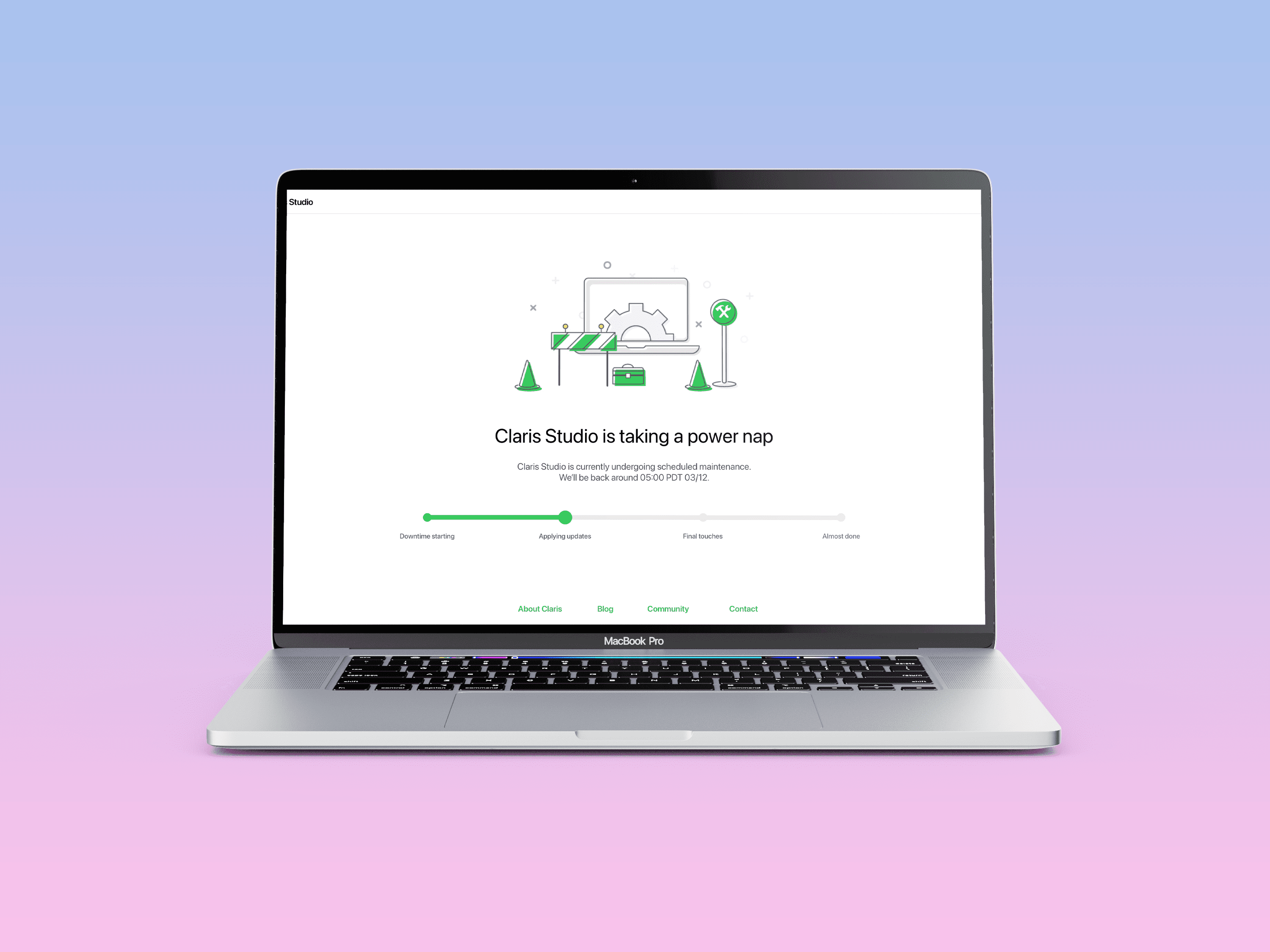
This project was designed for Claris Studio, a cloud-based data collection and management platform created by Claris, a subsidiary of Apple, Inc. Like any cloud based service, the goal is to have 100% uptime. However, there will be moments where the service needs to be taken offline for upgrades and maintenance. It was my task to create a customer-facing downtime page to communicate those moments when the product is temporarily unavailable.
Aligning With The Customer
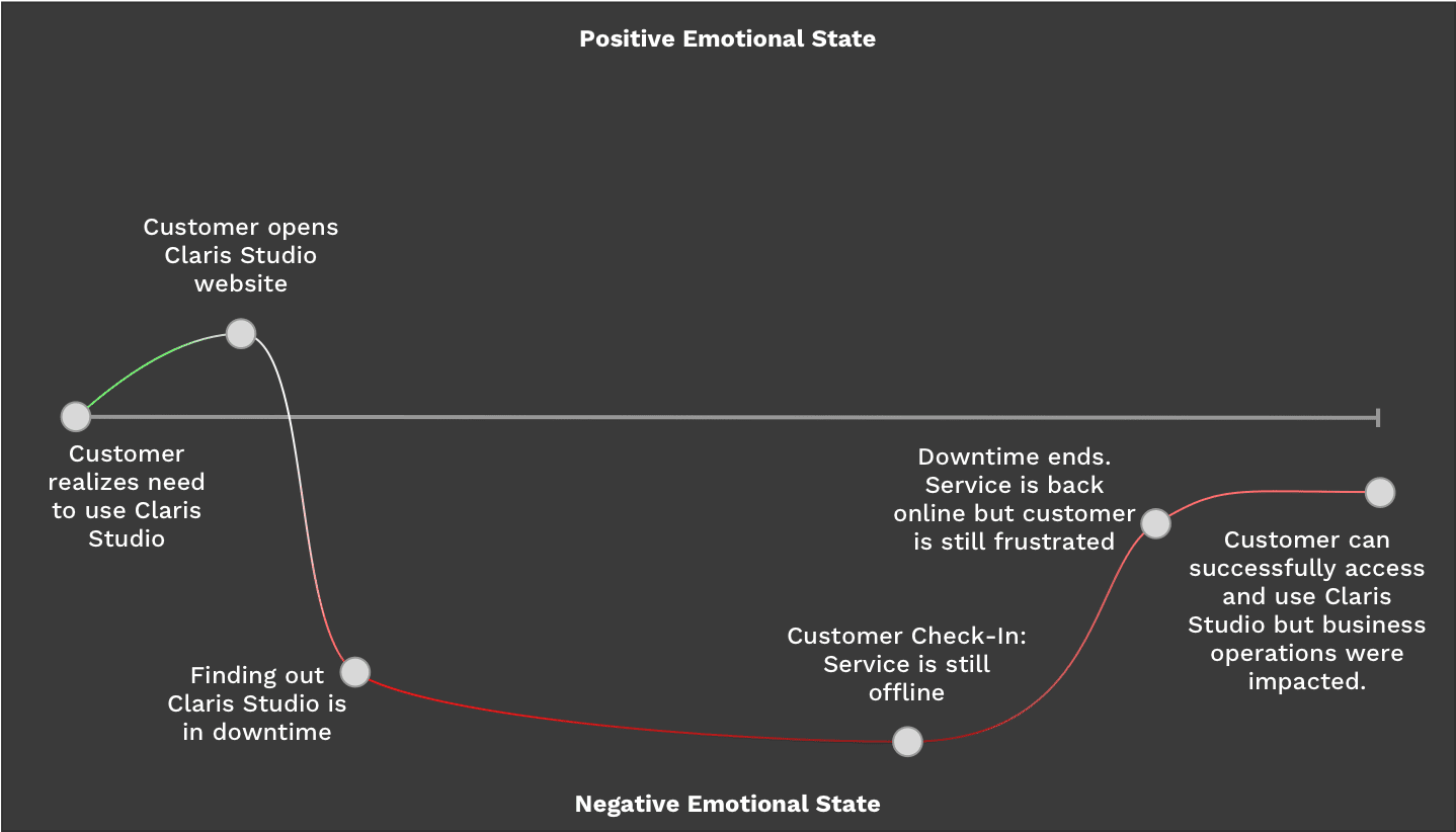
Anytime you go to use a tool you rely on to get work done and that tool is unavailable, it is always a frustrating experience. No one likes to be told that they can’t use a tool that they paid for due to no fault of their own. However, downtimes are inevitible and communicating those moments can help de-escalate the situation.
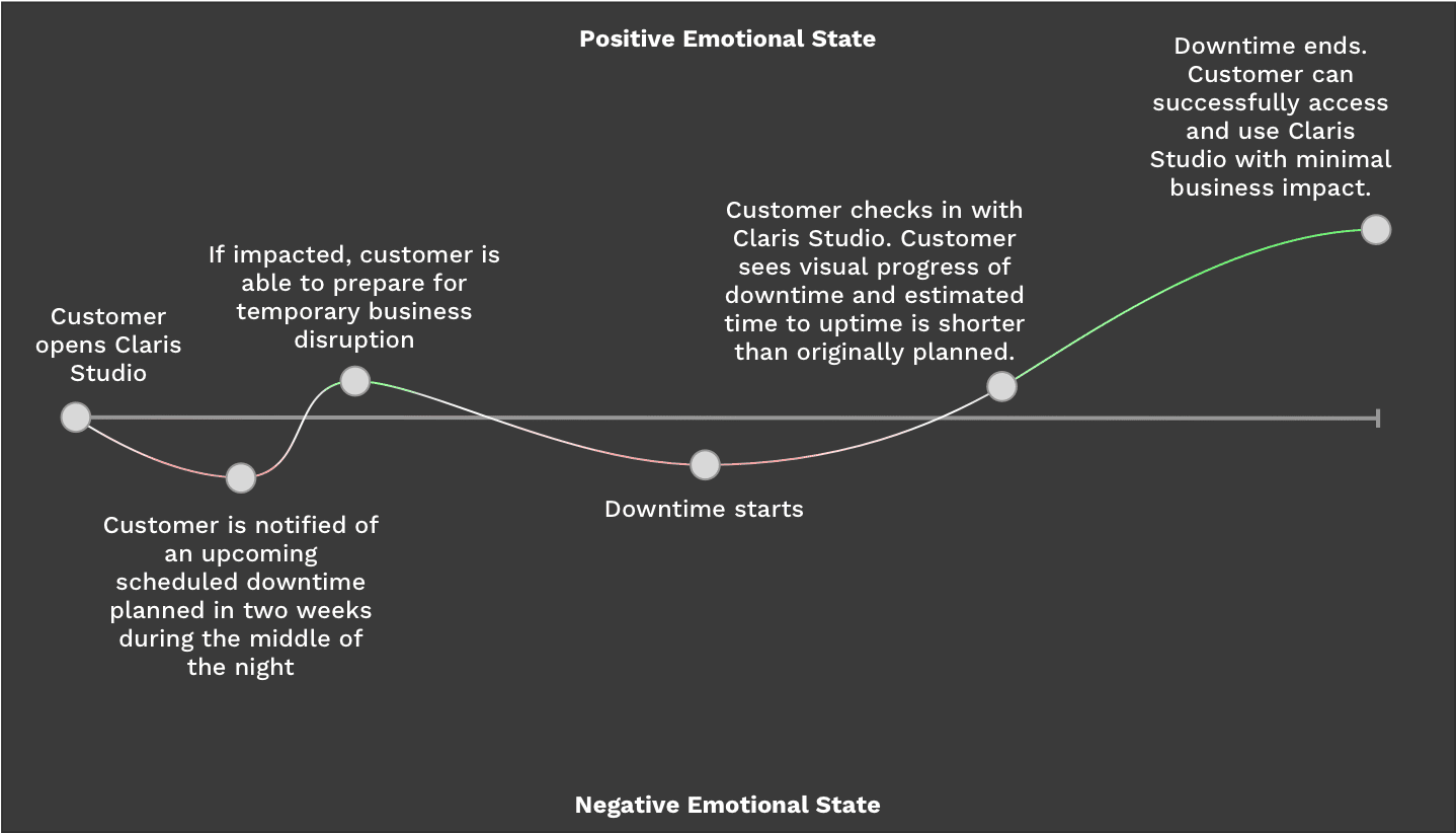
I started with identifying standout emotional checkpoints that I could build into an empathy map. Based off this, I can look to create positive experiences before and after the downtime to help minimize its impact on the customer.
Current Experience Empathy Map
Ideal Experience Empathy Map
Ideating Solutions
From the customer’s perspective, being notified about a downtime with enough notice to be able to work around them is paramount. This starts by informing customers about the downtime well in advance is the first step. Notifications would happen two weeks in advance via email and in-app. Two weeks was determiend a reasonable timeframe between planning internally and providing customers enough time to prepare.
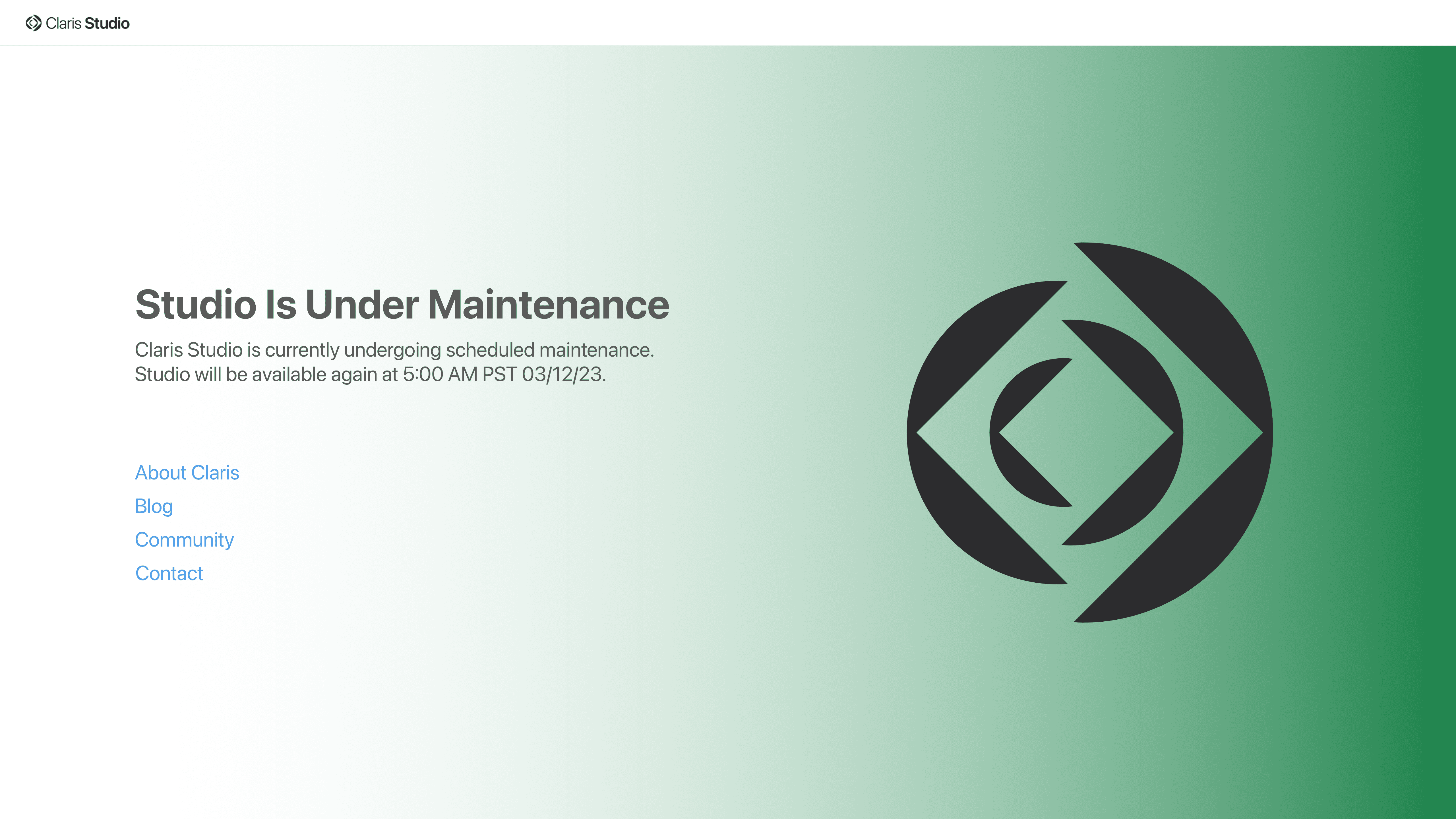
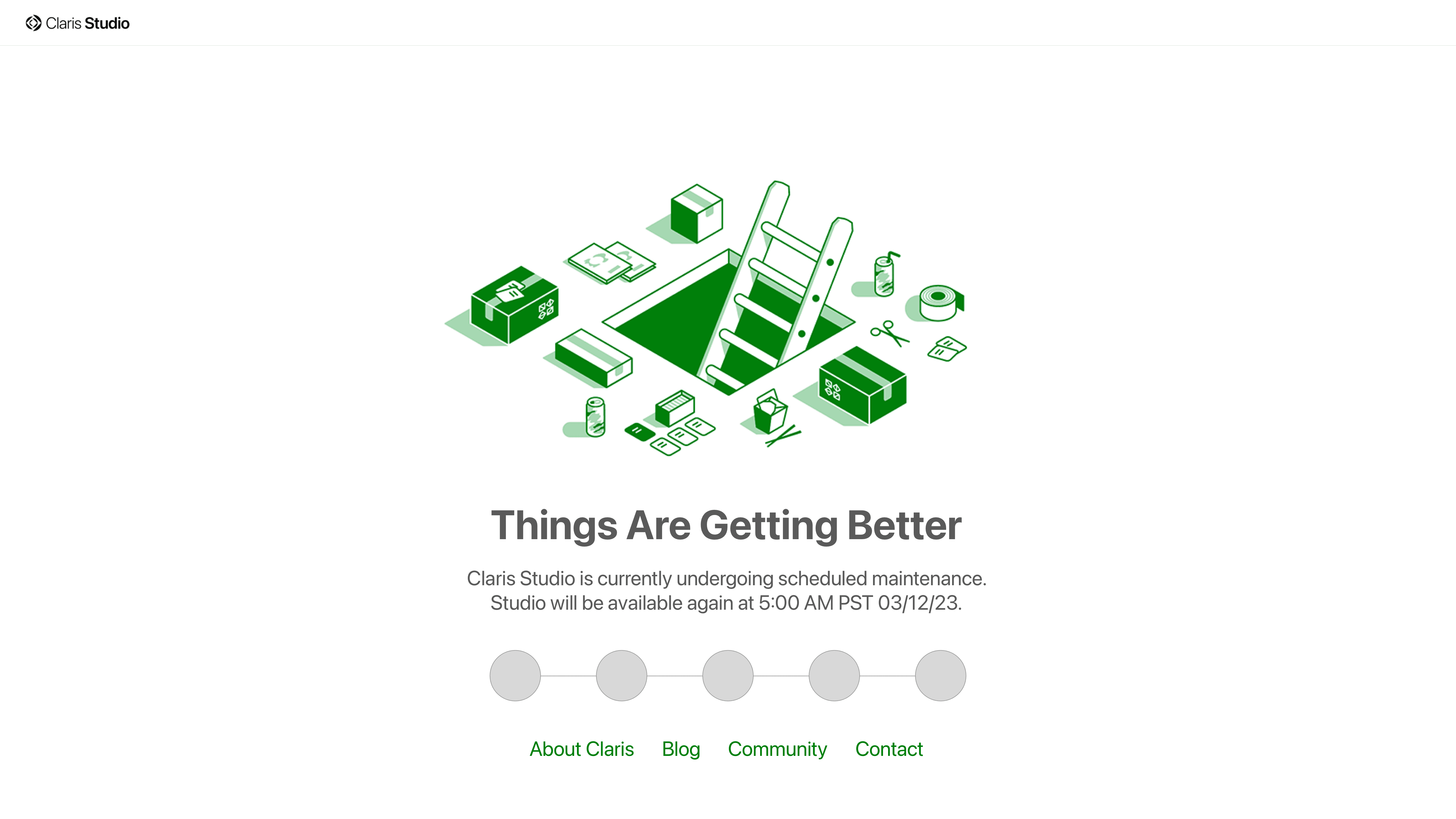
With my goal in mind, I also researched existing downtime pages to further gain inspiration. One common trend was the opportunity to show personality. One of our goals at Claris was to try and find “whimsical opportunities,” and this was definitely one. I tested several prototypes and came to 3 basic concepts shown here.
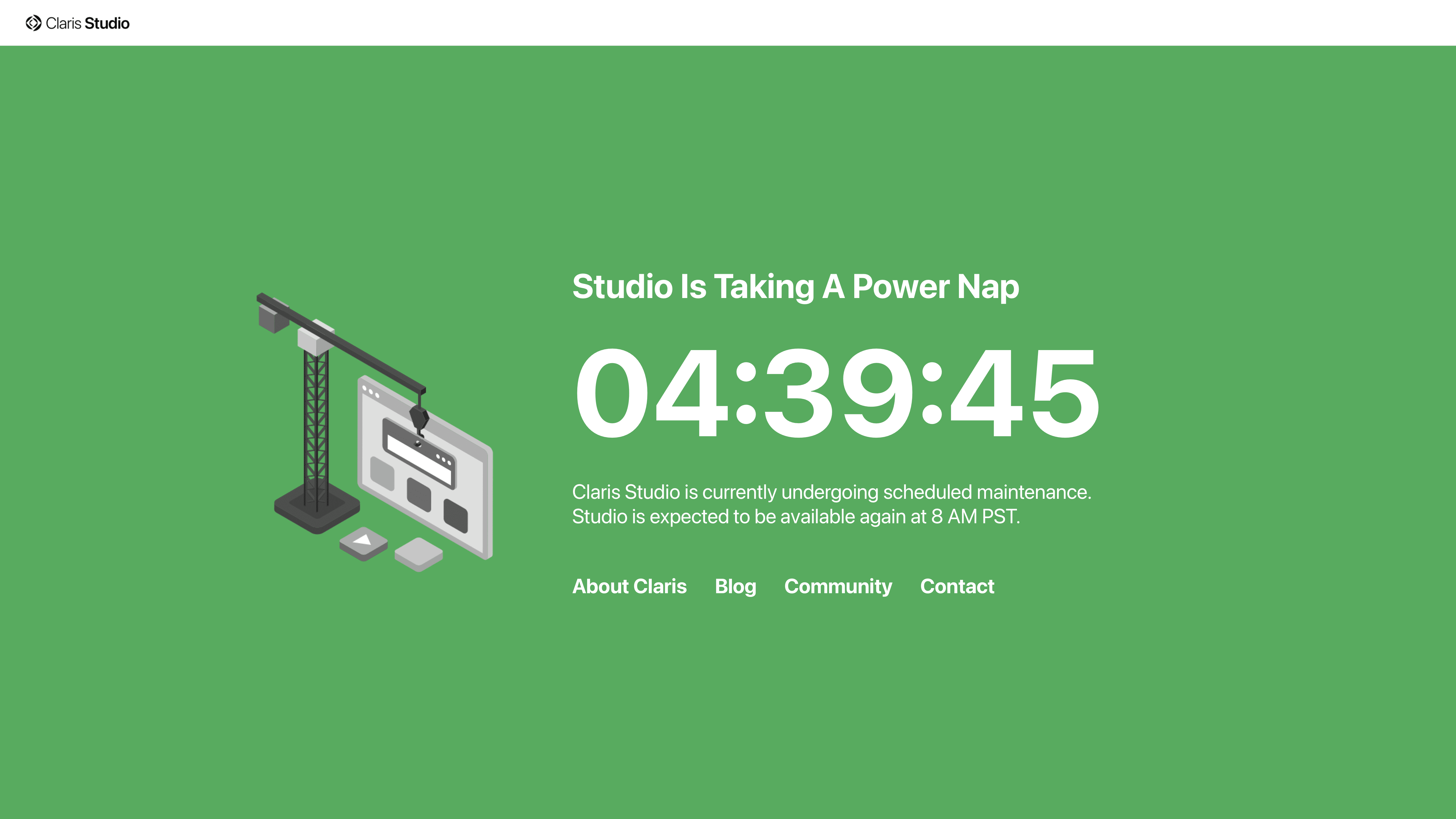
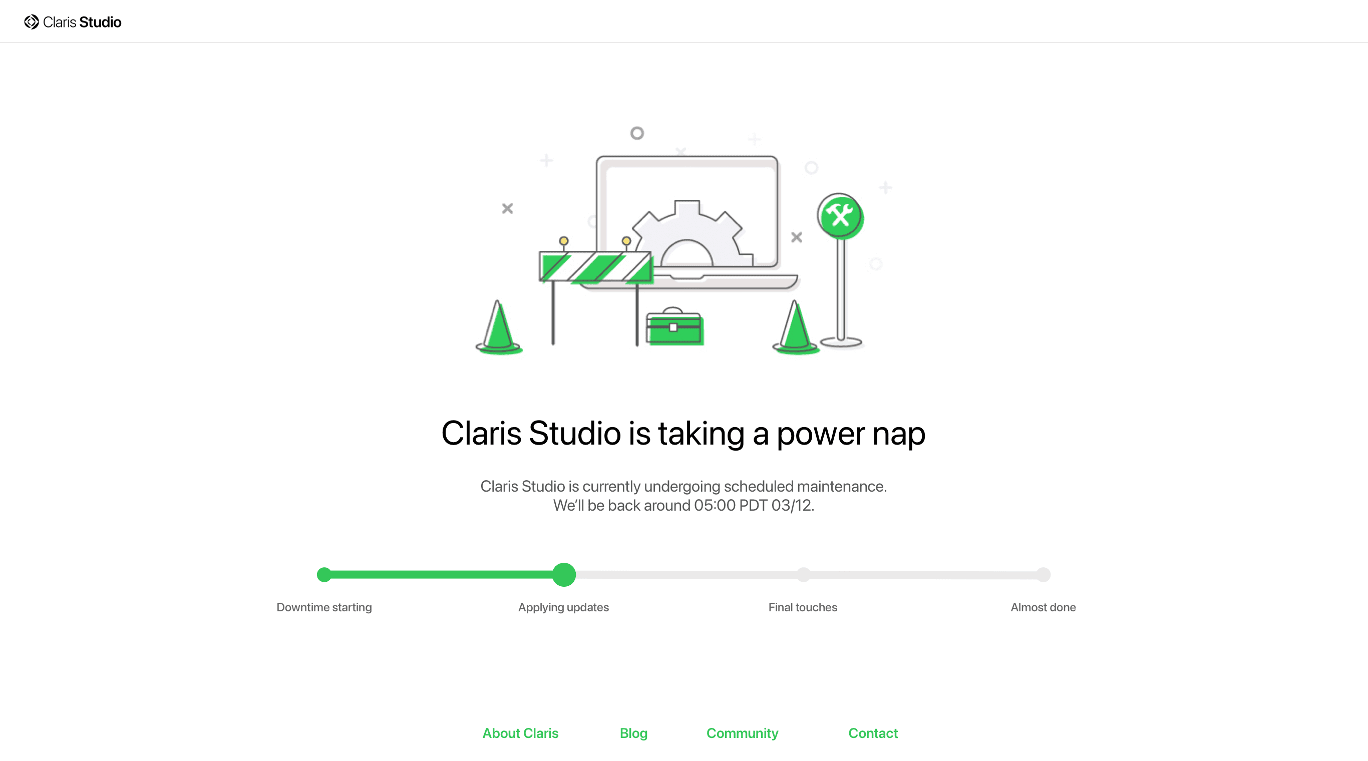
This final design was the result of finding a balance between customer awareness and internal flexibility.
Customers can feel in-the-loop with an estimated uptime and a dynamic timeline that provides progress udpates without providing specific information.
Engineering feels comfortable with have flexible deadlines that can accomodate unforseen issues.
Claris’ brand is appropriately represented and provides an opportunity for personality while still being professional, succinct, and informative.